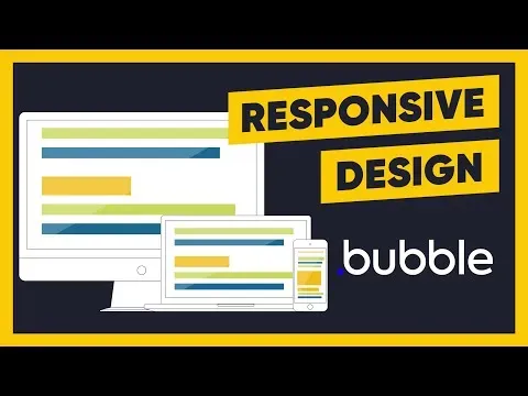
Responsive design made easy

 Learners:
2
Learners:
2
 Instructor: Kevin Powell
 Duration: 1.00
This course provides an easy-to-follow guide to creating a responsive design. It covers topics such as setting up custom properties, basic styling, starting the layout, and adding complexity. It is designed to help users create a website that looks great on any device.▼
Course Feature
 Cost:
Cost:
Free
 Provider:
Youtube
 Certificate:
Paid Certification
 Language:
English
 Start Date:
On-Demand
Course Overview
❗The content presented here is sourced directly from Youtube platform. For comprehensive course details, including enrollment information, simply click on the 'Go to class' link on our website.
Updated in [February 21st, 2023]
Responsive design made easy is an online course that teaches learners how to create websites that look great on any device. Learners will learn how to start a project, set up custom properties, apply basic styling, and create a layout with increasing complexity. They will also learn how to use media queries to adjust the design for different screen sizes, and how to use Flexbox and Grid to create responsive layouts. Additionally, learners will gain an understanding of how to use responsive images and videos, and how to optimize their websites for performance. Finally, learners will learn how to test their websites on different devices and browsers to ensure they look great everywhere.
Course Provider

 Related Categories
 Popular Providers
 Popular Searches